I quickly snapped some snippets of my bookshelves as the sunshine swept across them. They’re filled with vintage books with marbleized covers and wavy pages. Architectural fragments are bookends. A bowl holds glass beads and an old oil painting introduces something different. Large wooden candlesticks repeat on the shelves. An old French clock face is an interesting back drop for art on an easel.
Showing posts with label books with marbleized covers. Show all posts
Sunday, January 18, 2026
Saturday, February 6, 2021
HOW I ADDED OLD WORLD STYLE TO A VINTAGE CUPBOARD
My grey cupboard has always been a part of my kitchen. When we renovated the kitchen I thought about selling it, but I just couldn't bring myself to do it. There really wasn't a good spot for it in another room. For now it's in our family room until I come up with another solution. Here's what it looked like in the kitchen before we renovated.
I wanted to change it up a bit. My inspiration was this bookshelf designed by Tara Shaw. I like the look of wonderful books packed in to a space and going in all directions. If you don't follow Tara, you should. She's one of my favorite designers. Here's the link to her Instagram account:
![]() |
| TARA SHAW DESIGN |
You can see that I did pack in the books and have them going every which way like the inspiration. Once I got started though, my old world bookshelves took a different route. I wanted to mix objects and art in with the books and show the pages as well as the spines and covers.
Do you find the wavy rippled edges of old books just as interesting as the spines? I do. Many of the books were multiples so I was able to show them from every angle ----the marbleized covers, the spines, and of course the irregular pages. Don't miss the sphere I used as a bookend. It's a heavy ball covered in nails. I purchased it from a friend who found it in Paris. I have three and they're definitely favorites.
![]() |
| WAVY EDGE PAGES AND FRENCH NAIL SPHERE |
Even better are the books with marbleized pages. I just had to display the pages instead of the spines. I tucked a wooden bowl in to the corner. It's filled with strands of glass beads that pick up the colors in the books.
![]() |
| BOOKS WITH MARBLEIZED PAGES |
I also frequently add architectural pieces when I'm styling bookshelves.
These plaster corbels are perfect bookends.
![]() |
| PLASTER CORBEL BOOKENDS |
I couldn't forget to add some art. I've had this vintage oil for many years. I think I shared this before, but I found it at an auction hidden in the bottom of a box lot.
![]() |
| VINTAGE OIL IN THE STYLING MIX |
There's more art in another corner. I placed these mini french scenes on to bamboo easels and mixed them in with some books with paper labels.
![]() |
| MINI FRENCH ART ON BAMBOO EASELS |
What can be better than bird art on a nest easel?
![]() |
| BIRD ART ON NEST EASEL |
These natural wood turned candleholders blended perfectly with all the other warm browns on the shelves.
![]() |
| CANDLEHOLDERS IN WARM TONES |
To add a little color, I repeated the glass bead garland.
![]() |
| CANDLEHOLDER WITH GLASS BEAD GARLAND |
The large architectural fragment on the leather book repeats the corbel bookends.
![]() |
| ARCHITECTURAL FRAGMENT ON A SHABBY LEATHER BOOK |
How do you style your bookshelves? Just books? A mix? Do you have a theme?
ENJOYED THIS POST?
Sign up to receive a notification every time I publish by clicking here.
Saturday, August 17, 2019
Styling a Bookcase
I guess you've figured out that one of my favorite things to do is arrange vignettes. I absolutely love combining vintage and new to create a unique look. And, if you've been following me, you know that I change things frequently to the annoyance of my family.
My latest change up is an old step back cupboard in my kitchen. I decided to soften it up by painting the inside the same gray that I used on the outside. The inside was painted a Ralph Lauren red. It seems harsh to me now. Here's my before photo.
It had already been painted so I didn't have to sand first. I did prime it. Since the red was so dark, I used a shellac-based primer called BIN primer by Zinsser. This primer dries in 45 minutes, but if you don't like to clean brushes with chemicals, I suggest you use a small disposable foam roller brush for the big surfaces and a foam paint brush that you can also toss out when you finish. It covered the red in one coat. It took two coats of paint. This is the same paint color I used to paint my kitchen cabinets. (More about the kitchen later.) It's Benjamin Moore Rockport Gray.
I painted the kitchen two years ago and still like the color.
Here's a close up of the items on the shelves.
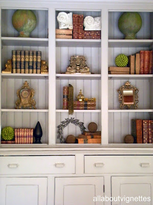
When styling a bookcase, the first thing I obviously do is assemble the items I want to include. I always select more than I need because not everything will work once you get started. It's important that the items are similar. Books always work and are one of the first things I place on the shelves. They can be used as risers and back drops for other items. An idea to steal is that books don't have to all be upright. If you look at the shelves, some are vertical, some on their sides, and those with interesting uneven pages are facing out.
My books are all either old leather books or ones with marbleized covers. If you're not interested in the hunt, or the expense of vintage books, you can achieve the look a la Restoration Hardware just by covering the books--just like you do with your school books--with paper.
Notice on the second shelf from the bottom they've placed an old dictionary with the pages facing out. The indentations for the alphabet create an interesting design.
After I place the books, (notice how I interspersed them on the shelves), I begin placing the larger items. On the top shelf are two cement garden orbs. They moved around a bit until they found their place on the top shelf. You need to experiment and move things in different spots,
or if they don't work, take them out of the mix.
Repetition of like items is another consideration. Notice that I selected architectural fragments. They're all different and at the same time blend and serve different purposes.
Some stand alone while others are used as bookends.
Another example of repetition can be seen in the orb shapes. The garden orbs that I already mentioned, the seed balls, and on the bottom shelf the three French orbs that are made with iron nails and weigh a ton.
If you look at them and the rest of the shelves, you'll notice that in addition to similarity of items, you must consider balance and symmetry.
Next I selected interesting items to fill in the other spaces. Notice though that except for the metal laurel wreath on the bottom shelf, they all have gold tones. The old clock, the vintage metal mirror, and even the gold boullion fringe draped over the books repeat the gold. See this repetition of color also in the book spines, the architectural fragment and the crown which is really a Christmas ornament. In addition to the gold, you can see green, which not only repeats, but adds a pop of color.
I hope you'll give it a try. It's a bit time consuming, but if you keep in mind Symmetry, Compatibility, Balance, and Repetition, with some juggling, you can do this.
I'd love to see your results.
To see another post with a totally different look about styling a bookcase, go here. My books are all either old leather books or ones with marbleized covers. If you're not interested in the hunt, or the expense of vintage books, you can achieve the look a la Restoration Hardware just by covering the books--just like you do with your school books--with paper.
Notice on the second shelf from the bottom they've placed an old dictionary with the pages facing out. The indentations for the alphabet create an interesting design.
After I place the books, (notice how I interspersed them on the shelves), I begin placing the larger items. On the top shelf are two cement garden orbs. They moved around a bit until they found their place on the top shelf. You need to experiment and move things in different spots,
or if they don't work, take them out of the mix.
Repetition of like items is another consideration. Notice that I selected architectural fragments. They're all different and at the same time blend and serve different purposes.
Some stand alone while others are used as bookends.
Another example of repetition can be seen in the orb shapes. The garden orbs that I already mentioned, the seed balls, and on the bottom shelf the three French orbs that are made with iron nails and weigh a ton.
If you look at them and the rest of the shelves, you'll notice that in addition to similarity of items, you must consider balance and symmetry.
Next I selected interesting items to fill in the other spaces. Notice though that except for the metal laurel wreath on the bottom shelf, they all have gold tones. The old clock, the vintage metal mirror, and even the gold boullion fringe draped over the books repeat the gold. See this repetition of color also in the book spines, the architectural fragment and the crown which is really a Christmas ornament. In addition to the gold, you can see green, which not only repeats, but adds a pop of color.
I hope you'll give it a try. It's a bit time consuming, but if you keep in mind Symmetry, Compatibility, Balance, and Repetition, with some juggling, you can do this.
I'd love to see your results.
Subscribe to:
Posts (Atom)