
I created some art above my family room mantel that was pretty economical. If you've been following me, you know that I love all things architectural.
At one of my favorite Pennsylvania hunting grounds, aka antiques shop, I found pages from a book containing architectural reference drawings. They illustrated examples of German, English, and Italian Renaissance Ornamentation, Mohammedan (Moorish) and 17th and 18th Century Ornamentation, as well Gothic Illustrations.
Here are some of the pages I found.


I purchased all of them. You can see that they are very unique and very interesting.
I wanted to create the over-sized art above the mantel in my family room. I haven't shared much of this room because it's the one room in the house that never seems to turn out quite like I want. I'm forever changing and rearranging. I've lost count of the change ups in this room. One of the problems is the wood trim and mantel. They're rough cedar and almost impossible to paint. At some point I want to paint all the wood white, but that would involve sanding it all smooth before priming and painting. I keep looking for other options.
Here's a photo of the the latest furniture arrangement and the rough cedar mantel. Yuck.

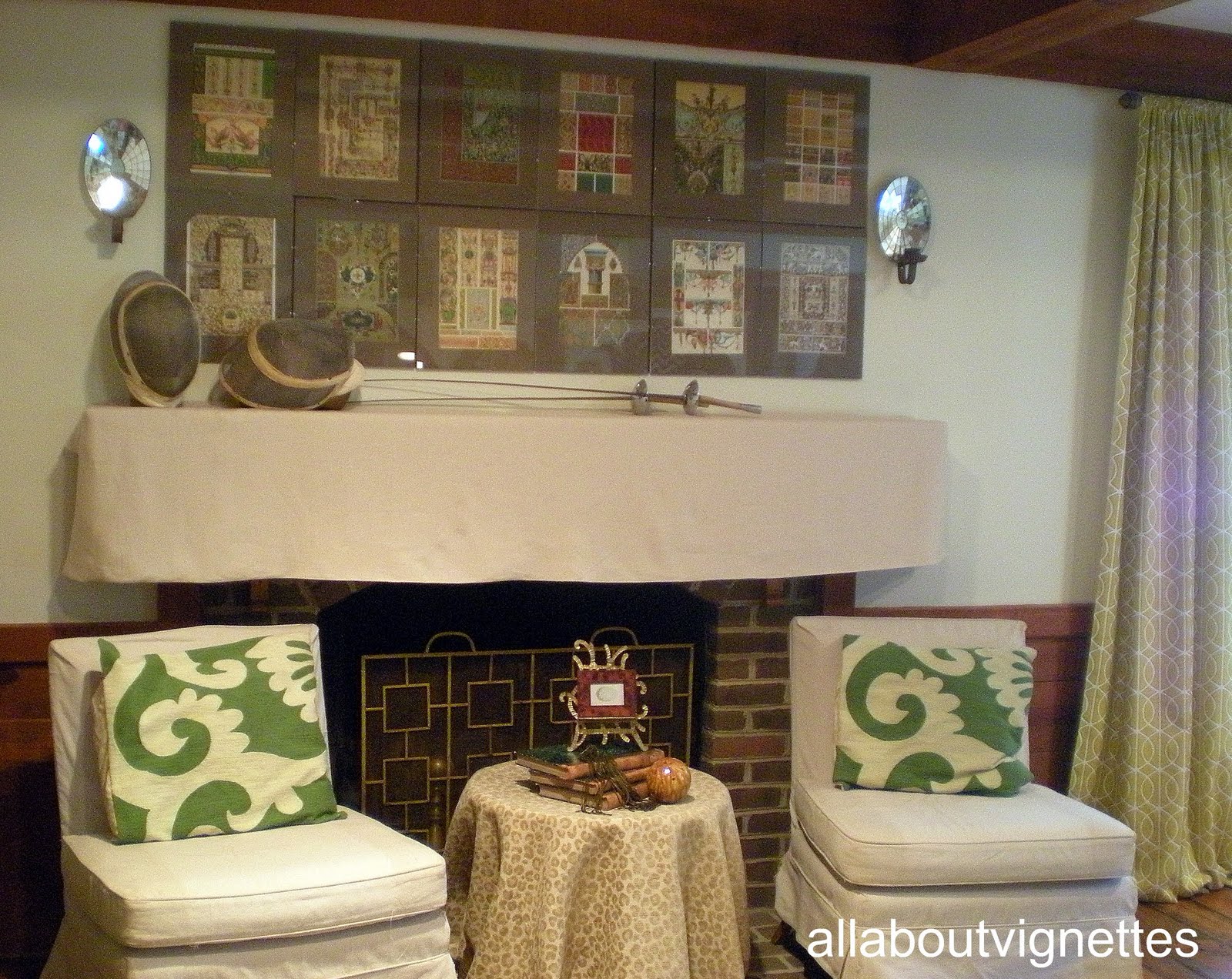
I slip covered the mantel in an off white linen, then found clear clip-on frames to fit the architectural reference plates. I played with the arrangement on the floor until I had a mix I liked, then assembled them into over-sized art above the mantel. I wasn't able to use all of them.

I added a pair of antique mirrored sconces and two orb finials below the sconces. The only other item I placed on the mantel was an iron bird. The reference prints had a lot going on and I wanted to keep it simple.

Here's the final result. What do you think?
But wait. I did a change up before I published this one.
(It's not the first time I've done this.)
I used some fencing masks and foils instead of the finials and the bird.
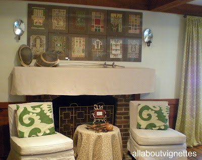
Which one do you like better? I just know that this still isn't the final result. I'll be playing with this. Different pillows? Different slip cover fabric? I'm even considering something other than the art. I have other places for the architectural reference prints.
I'd love to hear your feedback.
What have you done for art on your mantel? Please share.
Kathy
Here are some of the pages I found.


I purchased all of them. You can see that they are very unique and very interesting.
I wanted to create the over-sized art above the mantel in my family room. I haven't shared much of this room because it's the one room in the house that never seems to turn out quite like I want. I'm forever changing and rearranging. I've lost count of the change ups in this room. One of the problems is the wood trim and mantel. They're rough cedar and almost impossible to paint. At some point I want to paint all the wood white, but that would involve sanding it all smooth before priming and painting. I keep looking for other options.
Here's a photo of the the latest furniture arrangement and the rough cedar mantel. Yuck.

I slip covered the mantel in an off white linen, then found clear clip-on frames to fit the architectural reference plates. I played with the arrangement on the floor until I had a mix I liked, then assembled them into over-sized art above the mantel. I wasn't able to use all of them.

I added a pair of antique mirrored sconces and two orb finials below the sconces. The only other item I placed on the mantel was an iron bird. The reference prints had a lot going on and I wanted to keep it simple.

Here's the final result. What do you think?
But wait. I did a change up before I published this one.
(It's not the first time I've done this.)
I used some fencing masks and foils instead of the finials and the bird.
Which one do you like better? I just know that this still isn't the final result. I'll be playing with this. Different pillows? Different slip cover fabric? I'm even considering something other than the art. I have other places for the architectural reference prints.
I'd love to hear your feedback.
What have you done for art on your mantel? Please share.
Kathy


what a cool and dramatic way to have affordable art!
ReplyDeleteActually I really like your mantle uncovered, but the slipcover is a great idea, too! I love love love the art and the first picture is my favorite.
ReplyDeleteI am in serious love with the wood beams you have!!
We have stained trim throughout our house (pine) and a cedar mantle very much like yours. My DH refuses to even consider painting it. He has consented to perhaps using a darker stain on it to perhaps differentiate it from our floors which are pine planks and stained the same color. Maybe that is something you could consider for the mantel and perhaps the trim?
Really cool Kathy! Love that you slipcovered the mantle! I like the fencing masks and foils better...the orb finials were too 'balanced' and the shape competed with the sconces (LOVE the sconces) How about a mirrored fireplace screen? to add some shine behind the chairs. If you have 6 more of those prints, I would hang them in 3's vertically, on either side of the sconces to bring some balance to the rest of the wall space. Love the print on the pillows! The blog is looking great, Kathy! Keep up the good work!
ReplyDelete~Laura
Love you blog and the vignettes around your home. I also love the wood beams you have and don't hate the mantle. Have you thought about painting the brick? I think that would lighten it up and make the wood mantle pop then. Love the artwork over it though. That looks fabulous.
ReplyDeleteWho'd have thought to slipcover a mantle? Why, you, of course! I LOVE the Celtic knot print. It's right up my alley.
ReplyDeleteHi Kathy,
ReplyDeleteI really enjoy your blog! I like both the orbs/birds and the fencing equipment on the mantle. They both work and both look really good. I'm wondering about the table though. It seems a little off somehow. Maybe the accessories could be simpler/bigger or the tablecloth is too frilly to go with the sleek chairs? I'm not sure. I really like everything else.
I prefer the second option. The orbs are too tidy beneath the sconces. I agree that one more mirrored object would incorporate that shiny into the mix. Love the slipcover. Would also like muslin colored chalk paint on mantle. Distressed to show a lot of the wood color, almost like weathered driftwood.
ReplyDeleteI am crazy over the architecural art and their frames. GENIUS!