Tuesday, February 28, 2012

Glam Dresser

My husband knows what I like so well.  The other day he came home and said that he had seen a pair of dressers that he thought I would like.  Like!  I loved them.  So perfect.  So me.  We've been looking for something for either side of our bed for a while.  I almost purchased mirrored chests.  I'm so glad I waited.  This is one of a pair.  We went together and they were still available.  They're ours!


Glam Dresser
The drawers actually are silver leaf, not painted.  The actual chest looks like a black hammered metallic.  Swoon.


I couldn't wait to get them into our room.  This is my side of the bed.  I found these fabulous mercury glass lamps with oval linen shades and used the sunburst mirror as a back drop.


Here's my husband's dresser in place.   I've told you he loves to collect vintage cars.  I think that this one on his dresser is just the right size for his collection.


Above the sink in the master bath I placed this glam mirror.  I'm looking for just the right pendant light but haven't found it yet.


So who likes glam and sparkle?

Kathy


Friday, February 24, 2012

Dorothy Draper Espana Dresser Finds A Spot

Do you remember soooooo looooong ago when I was swooning over the Dorothy Draper dresser I found?
(To see the post if you missed it, go here.)

Well, I've given in and placed it in my family room. 
I knew from the beginning that it would go well in that room. 
But, if you've been following along, my family room is very dark and has tons of
dark wood too--and a dark sofa.
I was really resisting adding more black in that room even though black is my favorite color to use.
(It's actually everywhere in my home.)

To brighten it up, I framed some orange Trina Turk fabric. 
The pattern on the fabric reminded me of modern art.  I also used a white lamp base.  The turtle is faux.  I thought that the citrine draperies would  balance out the black too.


I think that it works.  Below is the full view of the dresser which I placed to the right of the fireplace mantel.  Can I say again how much I hate that cedar wood that's everywhere?


This next image shows how it looks with my X base coffee tables that are in front of the sofa.


So, too dark?  I really love that dresser.

Kathy


Tuesday, February 21, 2012

It's My Birthday Giveaway

Do you remember when I covered books with white craft paper and added images to the spines? 
 (To see the full post, go here.)

It's my birthday and I'd like to give a gift to one of my fabulous readers. 
I've made another set of books covered with a clock face just for you.


GIVEAWAY GUIDELINES


1.  You must be a resident of the United States. 

2.  You must be a Follower of my blog. (Sign up on my right side bar.)

To enter to win the covered books, complete this form.

The contest will run from now until midnight, Sunday, March 11, 2012.

Winner will be selected by Random.org.


Good luck to all.

Kathy

Saturday, February 18, 2012

Wonky Bookcase Gets Pretty

Well we've moved our daughter into her lovely apartment.  While we were making our thousandth trip in the service elevator I saw her large wonky bookcase.  I thought it was going to collapse as we loaded it onto the cart.  I seriously wanted to throw it into the dumpster that was very near the loading dock.  She said she really wanted to keep it so we hauled it into the apartment.  I was looking around and I saw an alcove in the hallway.  It was very shallow and narrow and seemed to serve no purpose but I immediately said that we should see if the bookcase would fit in that spot.  Yea, it fit snugly.  The sides of the wall would support the bookcase.  And you know me the queen of sow's ear to silk purse, I suggested that we add hounds tooth wrapping paper to the back of the bookcase to spiff it up.

On my next visit I brought my roll of wrapping paper and we added it to the back.  Then we styled it.
It looks so pretty now.


The sides weren't the only wobbly part.  Now that the sides were stabilized we addressed the other wonkiness.  The top shelf was falling down too.  
My solution, stack some books and hold it up.  It worked!


She had most of the accessories.  We just put all her stuff on the table and picked and chose what to add.  She had purchased the orange boxes and magazine holders before the move.  Not only do they add just the right interspersed pop of color, but they also provide much-needed storage.  My only contribution was the set of books with the elephant spines which she requested.


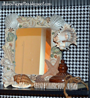
She had the shell mirror and the shells.  I always like to have a mirror somewhere when I'm styling a bookshelf and this one fit perfectly.


Did you notice that she likes owls?  They made great bookends.


She was very happy with the result, but I told her that when she moves again, 
this shelf is destined for the dumpster.

Kathy

If you'd like a tutorial about how to style a bookcase, go here for more detailed instructions.


Wednesday, February 15, 2012

February Sale at Stylish Patina Barn

Each month I've tried something different and I've had very good sales.  Hmmm, what "look" should I have?  I'm thinking that eclectic is what I love and what will work.  This month I focused on small furniture and accent pieces.   Below please find snippets of my stuff.


I


Hope to see you all there.

Kathy

Stylish Patina Barn Sale

February 17, 18, 19
10 am until 5 pm

Where are we?
4051 Stanford Ct. Frederick, MD

Directions from D.C. Area
1. 495 N towards Maryland
2. I-270 N
3. Exit 32 merge I-70 W Hagerstown
4. Exit 52 merge US-15/US 340 W
5. Merge to the the left, follow 15 S
6. Left Mountville Rd (1st traffic light)
7. 1st Left Winchester Blvd
8. Wind thru Stanford Industrial Park
9. 2nd Right at 4051 Stanford Ct.

Other Places to Visit!
Make it a day of shopping.....
Downtown Frederick MD (6 miles)
Downtown Leesburg, Va (15 miles)
Lucketts, Va (11 miles)
Chartreuse & Co. Barn (4 miles)

{blog/website} www.stylishpatina.com/thebarn


Wednesday, February 8, 2012

Modern Chinoiserie Night Stand

My sweet daughter, Sara, has decided that she doesn't want to live here with us anymore and is very excited about moving into her own apartment.  I only have one daughter, and even though she won't be far away, I'm sad and I know I'll miss her and our girly friendship.

But of course we've been having fun planning the decor for her apartment.  Let's just say that we've been doing some major shopping.   We found this modern Chinoiserie night stand for just the right price for someone on a budget. I was so surprised when I opened the latest post from
House of Turquoise  and saw the exact night stand featured and used as a bedside table too.
 

Tucker and Mark
 
Of course the night stand in the blog post had hardware,
but that missing hardware made ours quite a bargain.


The view from the side is just as cute as the front.  It's a white lacquer.
The shininess doesn't show in the images.


I was about to order replacement hardware on line when I found some knobs of all places but in the
bins at Michael's.  They were so cute and had peacocks on them.


We added them to the nightstand and they look fabulous.


Here's a closer look at the hardware.


I guess this night stand and the peacock knobs will be our inspiration for her bedroom.
We're going to go girly. 

We'll have more to share.  We're having so much fun.


Kathy


Saturday, February 4, 2012

My Saga of Horizontal Stripes

Me, the person who constantly tires of the current decor and changes things up still is in love with horizontal stripes.  I have been adding more and more of them.   I have an open stairwell in my foyer and I began my original horizontal stripes there.  I think that the horizontal stripes add something extra to a wall and make whatever is hanging there more interesting.  In the upstairs hallway is an over sized clock and a print.  I think the stripes make this fabulous clock look even better.


This is the view of the upstairs hallway and landing.
At a later date I added the stripes on the landing.


I painted the little alcove in the upstairs hallway the solid darker color.  I think that the dark color makes the salmon color of the Audubon print pop.


This is another image of the landing.


I then decided that since our bedroom continues in line with the upstairs hallway, I would add stripes on one wall there too.  The framed intaglios are centered on the wall.


In the next image you can see where the feature wall meets the wall with a solid color.


At the same time that I painted the landing, I did a feature wall in my foyer.


A close up.


And now to the whole point of this post.
 I'm thinking that I want to continue the horizontal stripes around to the opposite wall.
I also want to add the horizontal stripes to a third wall, to the right of the feature wall.  It leads into the living room and then the sun room.


That would be two stories of stripes.  I think I'm going to do it.

Kathy