Tuesday, June 28, 2011

Gilding the Lily

In an earlier post I gave instructions on how to style a bookcase.
This was the result of my styling.


I like the collected-over-time look of my bookcases, but I've always been drawn to the uniform look of the Restoration Hardware bookshelves with the books covered in
a solid color.  Here's one of the shelves I like.

Restoration Hardware
I decided I'd like to give it a try and found some large books at a sale.
My only requirement was that they were all similar heights.
They were perfect for covering.  I purchased some white craft paper on a roll and I was ready to go.  Anyone who has covered a text book can do this.


I measured the width and doubled the measurement.  To that I added the width of the spine plus 8 more inches to allow for the fold overs on the front and back covers.


Next I measured the height and added 4 more inches to allow for the folds on the top and bottom.


I unrolled the craft paper onto my sewing cutting board.  The grid helps me measure  and draw a straight line.  I used my metal square also to make sure all was straight.  I then covered the books with the same method I use for school text books.


Here they are covered.  You know me though, I just couldn't stop there.  It was time to gild the lily.  So much for the Restoration Hardware look.

I decided to add images to the spine of the books.  The first thing I did was copy an old clock face I had.  I then cut it into thirds.


I glued the image to the spine with Mod Podge.
I also top coated the images to protect and seal them.


I really liked how it turned out.
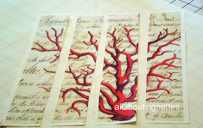
Since I still had more books, I selected another image and cut it in quarters.


I liked this too so I copied some antique architectural bookplates that I had and cut them into strips and applied them to my other books.


You can see that I used three books for the building and decided to turn the two other books with a different architectural print on their sides.  I staged this photo in my laundry room.  I haven't shared that room yet, but I have three over-sized architectural prints in stainless frames.  I thought they would be a good back drop.  The urn and the finial are also part of the laundry room decor.  Underneath the items is a weathered and mottled mirror.


Yes, I'm out of control with this.  I had several vintage cardboard childrens' animal toys.  I decided to copy the elephant, then I cut him into fifths to fit the books I had.


I did a twist with this one.  I had some orange wrapping paper left over from Christmas.  I have to say that it was much easier to work with the wrapping paper.  I also removed the white back ground from the elephant copy before gluing him down.


I think I like the elephant the best.  What's your favorite?

ENJOYED THIS POST? 
 Sign up to receive a notification every time I publish by clicking here.

Thursday, June 23, 2011

A Favorite Feature---A Back Splash Alternative in My Knotty Pine Kitchen

I've been thinking about writing about my kitchen for a while.   My back splash alternative is my favorite feature.  I used faux snakeskin fabric and nail head trim to fill the space.

Yes, the 1970s called and they want my kitchen. 
Since we moved here we've wanted to redo the kitchen but just haven't decided how we want it and haven't been able to commit to an expensive undertaking. 
So, we're in a time warp.
Until we decide to take it on,  I'd like to share my efforts to make a silk purse from a sow's ear.
A few years ago I was able to finally convince my husband that knotty pine should be painted.  You know the story guys love "real" wood.  I wasn't blogging at the time so I didn't take a before picture, but this is the inside cabinet door which should give you an idea of how lovely the kitchen was.


I painted the cabinets gray before gray was hot.
It's Benjamin Moore Rockport Gray.
I used their Aura brand.  You don't have to do a primer coat first.
I removed all the doors and labeled and numbered each one.  Boy was that a life saver.  I never would have been able to assemble them again.
I sanded, cleaned them off, and painted them with a foam roller made for wood.
Very nice smooth finish.

Blocked View to Kitchen Table
Notice that I didn't replace the horrible counter top.  I don't like the configuration of the room so I didn't want to spend money on a counter top that would eventually be discarded.  See that dark square in the upper right  corner.  That's the upper cabinet that I want to take a sledge hammer to.
When you're in the kitchen it totally blocks anyone seated at the table and anyone who wants to talk to the chef has to duck his head to see.

Painted Kitchen


Blocked View From Kitchen Table to Chef


I changed the knobs.  I used pulls on the drawers and bird cage knobs.
I kept the ugly hinges because I was afraid if I changed them they wouldn't hang right.

New Drawer Pulls

New Bird Cage Knob and Original Ugly Hinge

Above the sink there was this awful scalloped wood valance.  I was going to tear it out, but it was toe-nailed in pretty tightly.  Instead of removing it I covered it with a carved wood section that originally would have been a back splash for an old wash stand or a small dresser.

Above the cabinets was a built in space.  Originally, there was a wallpaper border going all around this area.  Sorry, no picture.  I removed the border and painted it the same color as the cabinets so it would somewhat blend.  I did nail head trim where the board meets the beam.
No comment on the rough cedar wood trim.

Decorative Wood Panel Covering Ugly Scallops

Now to the point of the post--the back splash.

My favorite update  was my back splash alternative.  As with the counter top, I didn't want to go to the expense of a new back splash.  My solution was  Duralee Snakeskin fabric.  It's no longer available, but if you go to your favorite online fabric store and search snakeskin or animal fabric you should be able to find something similar.  I found this faux leather  lizard on Fabric.com.
My faux snakeskin already had a protective coating.  I applied it with wallpaper paste.
 It wipes clean and I love the look.
Notice that I finished off the edge where the counter meets the fabric with nail head trim.

Duralee Faux Snakeskin Fabric as Back Splash

Monday, June 20, 2011

Birds, Shells, Artists' Brushes, and Emu Eggs. Oh MY!

I guess you're wondering how all that is related.  I didn't realize until I started looking around my house that many of the vignettes with my vintage finds are displayed under cloches. I also realized that so many of my finds are nature-related.  I'd like to share some nature under glass.


Nature Under Glass


If you saw my screened porch redo, you noticed that I had an assortment of shells and a mercury glass bird displayed under the cloche.  I used a metal footed pedestal that I found at an antiques store as the base.  This grouping was easy to assemble.  I placed the shells in first because I had a seashore theme going on in the room.  It was tricky to slide the cloche down over the coral fans.  I had to try and balance them as I slid the glass over it all.  After looking at it I knew it needed something else.  I had some mercury glass accents in the room, so I lifted the edge and gently slid in the bird that I stole from my laundry room.  If you're new to my blog, you'll find out that things have a way of moving from room to room.

Here is an image of the vignette on my garden table.  Hanging above is my metal orb pendant.

Garden Table Top Vignette

More Shells Under Glass

These shells are in an ironstone bowl.  The Williams Sonoma cloche fit perfectly over the bowl.

In Place In My Sun Room


I added more shells on the Asian chest.  On the left is a metal representation of a piece of coral on a stand.


My Nature-Inspired Bookcase


The other cloche I have is on my family room bookcase .  I actually found a cloche that said nest so I thought that the emu egg on a stand would be perfect.  In my mirrored dresser tray stash I was able to find a tray with the perfect dimensions to use as a pedestal.  Here it is in place on one of a pair of bookcases I styled (top shelf, center).  If you missed the post, go here. 

A Selection of Vintage Artists'  Brushes Under Glass


I know, so much for the nature theme.  I purchased these vintage artists' brushes at an antiques store.  This was quite a cloche maneuver.  Again I used a mirrored dresser tray as a pedestal.  There was no way I could tuck the brushes in  place while the cloche was upright.  My solution was to turn the cloche up-side-down, place the brushes inside, put the dresser tray over the bottom and flip it over.  It only took a few flips to get the arrangement I wanted.


Vignette with Artists' Brushes and Bottles

What treasures have you placed under glass?

Kathy


Friday, June 17, 2011

Deer Salad

 They're baaaaaack!  I have to say that BB (Before Bella, our yellow lab), I removed any plants from my yard that were a temptation to deer. Deer 10 me 0.   Now though, AB (after Bella) I've gradually been re-introducing some of their favorites.  It seems her presence keeps the deer away.  I'd decided that hostas are the deer equivalent to romaine lettuce and they would be the true test.
A Happy Hosta

  I really thought we had it under control.  I decided it was safe to divide the hostas and place them along the new walkway.  This is what it looked like when I planted them.


I guess so many hostas was too much of a temptation.  The deer are back and enjoying their salad.
Are the impatiens next? 

Very Unhappy Hostas


Those light green sticks on the right are what the deer left behind.


They haven't gotten them all yet.   We spread some Milorganite, a nitrogen rich " natural" fertilizer (made from sludge--yuck), which claims that its smell will keep the deer away. 
Please share any deer grazing solutions that have worked for you.  The Deer Off  and the Liquid Fence spray worked, but I have to remember to re-apply it after it rains.  Too much for me. The fox urine didn't work. Neither did Irish Spring soap.  Hopefully, the Milorganite will keep them away and fertilize my clay soil.
My Shasta Daisies just bloomed.  Are they next?


How does your garden grow?

Kathy


Tuesday, June 14, 2011

Foyer Wall Sconce Change Up

Guess what?  I'm changing something in my house.
These wall sconces have been in my foyer for many years.  I actually like them and still do, but I found some others that I like better.  Here's a close up of  one of the current sconces.


Before I share the new ones, I just want to say that there are ways to add touches to simple sconces.  These sconces were pretty ordinary brass with no extras.
This is the before.


  I embellished them by adding the gilt shell.  It originally was a vintage curtain tie back.  I liked its shape and look and simply drilled a hole in the center of it and attached it with the screw that goes into the wall mount.  If your addition is thick, you may have to purchase a longer screw.  I purchased the bobeches and added them.  They already had the beads attached which really added some sparkle.
I've also seen bobeches with hanging crystals.

The faux leather shades are from SteinMart.  It's my resource for reasonably-priced shades.  It's the only place I know that carries a large selection of the sconce/chandelier shades.  I once needed 12 matching shades for a very large chandelier and found them there.

Here they are on the wall.  They flank the coat closets and an archway into the living room.
Chandelier glare from the living room.  Sorry.


This is a side view.


I'm replacing them with these by Alexander-John.  They have a more modern look.  They also have a sheer shade with another shade within as a liner.


A closer look at one of them installed.


.
A side view of the pair.


And here they are lighted.


What do you think?

Kathy


Saturday, June 11, 2011

What A Great Day at The Pink Poet Tag Sale!

Whew am I tired, but what a wonderful day!  I want to thank everyone who came by.  I enjoyed chatting with all of you.  It was a hot hot day, but the rain held off and not only did I see so many friends, I met many new ones.   Tilly of the Shabby Acorn is my new best friend.  I bought a fabulous piece of furniture from her.  I was very tempted by her vintage windows with the hand-painted designs.  
I'm sharing an image below of her "chandelier" on glass.
And a super big thank you to all of you who bought my stuff.  I hope you'll enjoy your purchases.

Here are images of some of the fabulous finds available at the sale.


The next sale is July 9.  Don't miss it.

Future sale dates for the Pink Poet Tag Sale:
August 13, September 10, and October 8.

Mark your calendar and get ready to shop.

Kathy

Wednesday, June 8, 2011

DON'T FORGET : Sale at The Pink Poet Antiques This Saturday

I just wanted to remind everyone that the sale at The Pink Poet Antiques is this Saturday.
I'll be participating in the 2nd Saturday  Sale at The Pink Poet Antiques, a fabulous shop located in the historic downtown section of Laytonsville, Maryland.  


The Pink Poet Antique Shop

Behind the shop is a cottage, filled with stylish decor by Rita and Fran of and coco too.  If you ever shop at Chartruese and Company, you know their stand-out to-die-for finds.
This is an additional location for them.

and coco cottage


I will be sharing space with other vendors outside on the property.  

2nd Saturday Sale
The Pink Poet Antiques and coco too
Saturday, June 11th
21412 Laytonsville Road, Laytonsville, Maryland
10 am to 5 pm

There will be multiple Guest Vendors offering their unique collections of antique and vintage furnishings and accessories--industrial to cottage chic, garden decor, estate jewelry, vintage clothing, art, primitive, general store displays and collectibles.

Future Sale Dates

July 9, August 13, September 10, and October 8

IMPORTANT:  Park across the street in the elementary school lot.

I'll share some vignette teasers.

One of my obsessions is vintage books with leather and marbleized covers.  I'll have some there.


This slipper chair looks sooooo Anthropologie.


I'll have vintage letters and this hand-painted suitcase.  See the folding camp stool on the left.   I have two.   Add a tray or a piece of glass and they'd be perfect garden end tables. 
Or put them side by side as a coffee table.


Maps are a hot decor trend.  


Who doesn't like ironstone?


Trending now, bamboo.


Old bottles, lab bottles and cloches are all hot to shop for.  In the foreground is a stack of scale weights.  Perfect for holding down papers on your desk.  Get organized.


Vintage garden is always in.


The 4th will soon be upon us.  Get your red, white and blue on.


I'll have more furniture too.  Please stop by and say hello.


Kathy