Saturday, September 19, 2020

MY KITCHEN RENOVATION: THE CHOICES I MADE THAT WORKED

I just finished renovating my kitchen.  If you missed the kitchen reveal, click on the highlighted words to be directed to the post.  I'm adding posts with more details about how it all came together.  Today I want to share the choices I made and how they worked. There are links to my sources also.


CHOOSE AN EXPERIENCED DESIGNER  

This is your number one priority.  You need someone who's done this before. Monica, @monicagarrettinteriors just made it all work.  So many mistakes and regrets were avoided.  Plus, she made it all run smoothly and handled issues that came up.

CREATE A PINTEREST BOARD

More on this in another post, but I began pinning everything I thought as a possibility for the new kitchen months before I began the project.  It helps you decide where you want to go with the design and once you enlist the designer, you can share your boards so he/she can get a feel for your style.


LIGHTING CHOICES

I definitely wanted double pendants over my table.  I was looking for a lantern design.  When I saw these beaded wooden pendant lights I knew they were the ones.  It was a lantern pendant with a twist and you know how I always like to twist things up.  It helped my decision that they were black.

PAIR OF BEADED PENDANT LIGHTS

I decided that I'd use recessed lighting in the main area and put a brass pendant light above the sink.  I didn't want to take away from the fabulous pendants above the table or block my custom hood.

BRASS PENDANT LIGHT

COUNTERTOP AND BACKSPLASH

Oh how I wanted a marble countertop and backsplash.  I knew that I wasn't that person who was careful when cooking, so I opted for porcelain countertops and backsplash.  I can't tell you how happy I am with the choice, especially when red wine is on the menu.   If you'd like to read about the pros and cons of porcelain go here.


PORCELAIN COUNTERTOP AND BACKSPLASH

HARDWARE

My hardware is brass.  My best choice was to select pulls for all the doors and drawers.  No knobs in sight.  I varied the direction and placement of the pulls.  Notice that my dishwasher is black rather than stainless like the other appliances.  I wanted it to recede on this side rather than stand out.  All my appliances are KitchenAide.

PULLS INSTEAD OF KNOBS

One of my favorite suggestions from my kitchen designer, Monica, was to purchase 18" matching appliance pulls for the floor to ceiling pantry doors.  


APPLIANCE PULLS ON FLOOR TO CEILING PANTRY DOORS


CABINETS

I'm very happy with the espresso cabinets.  I had updated my laundry/pantry many years ago.  It is a combination of black and natural wood.  I've never tired of that room.  I knew using espresso and natural wood would work in the kitchen as well as tie the two rooms together. 

PEEK INTO ADJOINING PANTRY

PAINT COLORS

 I'm sure you've noticed that I painted the windows and doors black.  It's Benjamin Moore Black HC-190.  I also removed and replaced all the rough cedar trim.  The new trim color is Benjamin Moore Cloud White #967.  The walls are Benjamin Moore Monterey White HC-27.

CABINET DRAWERS VS CABINET DOORS

Wherever possible I added drawers instead of doors.  I have two reasons for that.  First, you can see everything in the cabinet.  Second, they just hold more items.


MORE DRAWERS THAN DOORS

I can see all my pots and pans!!!

POTS AND PANS DRAWER

I can't believe how many bowls fit into this drawer!!

DRAWER FULL OF BOWLS

CUSTOM HOOD

This brass and enamel hood was my splurge.  I'm so glad I did it.  I'd been pinning images with this hood forever so I just decided it was something that needed to be a part of my kitchen.

CUSTOM HOOD

DOUBLE ISLANDS

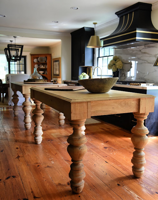
What can I say?  Those islands make the room.  They've been the most commented on and asked about feature of the whole kitchen renovation.  I highly recommend DOUBLE islands.  One has become the prep island and the other the hang around eating spot.  It's also so much easier to walk between two islands to get to the other side of the kitchen than to walk around one large one.  I love them.  I also want to mention that I never pass up a piece of furniture, or two, with great legs.


DOUBLE KITCHEN ISLANDS

SINK AND FAUCET

I chose a brass faucet and a black granite sink.  The gooseneck faucet combined with the deep sink make it so easy to wash large pots and pans and stack and rinse dishes.


FAUCET AND SINK


FEATURES I ADDED THAT MAKE THE KITCHEN WORK

Pull out combo trash/recycle cabinet.

Appliance garage

Cabinet with support for cookie sheets and cutting boards

Drawers, drawers, and more drawers


SOURCES:

KITCHEN DESIGN / BEADED LANTERN LIGHTS / COUNTERTOPS AND BACKSPLASH / BRASS PENDANT LIGHT /  HARDWARE / ISLANDS / FAUCET / CUSTOM HOOD / GRANITE SINK / CABINETS


What are your favorite kitchen features?

Did you know that I love it when you leave a comment?  Reader feedback makes my day.  
I'm happy to answer your question here, or I can also respond personally by email.  You can find my email in my contact info.  Thanks.


Saturday, September 12, 2020

MY KITCHEN RENOVATION REVEAL

After talking about renovating my kitchen for many years, I can now say that I did it!  I couldn't be happier with the result, and I couldn't have done it without help from my design guru friend, Monica, @monicagarrettinteriors.   She made my ideas work, offered suggestions that only someone who's done this before would think of, and sourced my wish list. 

I'm really excited to share my new kitchen.  I knew I wanted to remove the wall between the kitchen and the dining room and create one long galley kitchen.  

MY NEW GALLEY KITCHEN

 This next image includes the dining room opening into the kitchen.  I kept my original table and chairs, but removed the single pendant light and replaced it with a pair of oversized beaded wood lantern pendants.  

DINING ROOM TABLE AND CHAIRS WITH NEW LIGHTING

If you're looking into the room from our family room, this is the view.  Did you notice that I painted the windows and french doors to the sun room black?  The black paint ties the room together.  Everyone who follows my blog knows how much I love to use black in my home.

VIEW FROM THE FAMILY ROOM

The other dramatic change that we made to the space was removing the cooktop countertop that jutted out from the wall and divided the room in half.  I've written about the countertop and my knotty pine kitchen before.  To see the BEFORE now, click on the highlighted words.  Or, wait and there's also a link at the end of this post.  You'll see that we gutted the entire kitchen.  The floor was all that remained.  We moved the cooktop and hood against the wall.  The hood was on my wish list and was my splurge.  I love it.

MY BLACK AND BRASS HOOD

I wanted a marble countertop and backsplash, but gave in to my practical side and chose a porcelain marble look alike for easier maintenance.

MY PORCELAIN COUNTERTOP AND BACKSPLASH

Also on my wish list was a floor to ceiling pantry.  You can see it on the opposite wall.

FLOOR TO CEILING PANTRY

The pantry is a combination of drawers and doors and is perfect.

MY PANTRY:  A COMBO OF DRAWERS AND DOORS

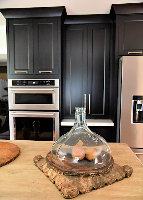
I also wanted an appliance garage.  It's between the oven/microwave and the refrigerator.

APPLIANCE GARAGE

I can't even begin to tell you how much I love and how much use I've gotten from these double islands.  They almost make me love cooking.  Those legs!!!!!

MY DOUBLE KITCHEN ISLANDS


If you're considering updating your home, please contact Monica.

You'll love her style and appreciate her design expertise.  

Click on the highlighted words to be directed to her site.

Monica Garrett Interiors


Interior Design Studio + Online Furniture Boutique | Full Service Interior Design& Staging 
 

To see my latest post about the choices I made that worked, go here.

If you'd like to see my BEFORE kitchen, go here.  

Or click on the image to be directed to the BEFORE post.

BEFORE

ENJOYED THIS POST? 
 Sign up to receive a notification every time I publish by clicking here.

Saturday, September 5, 2020

STEAL THESE RETAIL DETAILS: STACKING BOOKS

Using books to style a retail space has always been my go to for merchandising.  I use books as risers,  stack them in cloches and urns, cover them with animal prints, or wrap them in ribbons.   I selected some of my favorite store displays with books to share with you. Of course you can use these same ideas to style your home.


I love urns in any shape or size.  Filling them with books makes me love them even more.

BALANCED ON AN URN


TUCKED INSIDE AN URN


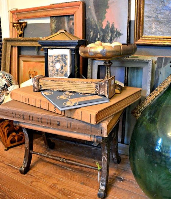
Rather than upholster this footstool, I used it as a base for some oversized books and created a "table".

OVERSIZED BOOKS CREATE A TABLE TOP


Books make perfect pedestals for displays.

PLASTER RAM ON A BOOK PEDESTAL


TURTLE SHELLS ON A TOWER OF BOOKS


A cloche is the perfect way to display treasures under glass.  This time the treasures are a stack of books that make the bust just the right height.

BOOKS AS RISERS


Mix or cover them with animal prints?

STACKED INSIDE A TRAY


STACKED BOOKS WITH ANIMAL PRINTS


What about wrapping the books together?

WRAPPED IN A VELVET RIBBON


WRAPPED WITH A BELT


You can also stack sideways.

STACKED SIDEWAYS AND VERTICALLY


STACKED VERTICALLY


I like stacking them inside the shelves of a cupboard.

INSIDE A CUPBOARD


STACKED INSIDE CUPBOARD SHELVES


City, state, and longitude/latitude, make perfect stacks.

STACKING BY LOCATION AND CO-ORDINATES


How do you  use books to style your space?

To see all my store styling, go to my Pinterest page here.

Or follow on Instagram @allaboutvignettes.